Selecting the right paint colors can transform a house into a home, but choosing shades that complement each other from room to room is an art. Without careful planning, clashing tones can make spaces feel disjointed and chaotic. Creating a harmonious color flow not only enhances your home’s aesthetic but also improves the overall sense of comfort and cohesion. Here’s a guide to selecting paint combinations that make your home feel connected, stylish, and inviting.
Start With a Color Palette
Before committing to any paint, it helps to define a base color palette. This doesn’t mean every room needs to be the same color, but having a set of complementary hues can guide your choices. Typically, a palette includes a primary color, a secondary color, and one or two accent colors. Neutral tones such as soft whites, warm grays, and muted beiges are excellent for primary shades, providing a versatile backdrop for bolder secondary colors.
Once you have your palette, consider how each color interacts with light. Natural and artificial lighting can significantly alter how a color appears, so test samples in each room at different times of the day. This step ensures your chosen shades maintain harmony throughout the home.
Create a Sense of Flow
To achieve a smooth visual flow, think about how one space leads into another. For open-plan layouts, it’s wise to limit stark contrasts between adjacent areas. Instead of using completely different colors, vary the tone or saturation of a single hue. For example, a soft, muted blue in the living room could transition into a slightly deeper shade in the dining area. This subtle shift maintains interest while preserving a sense of continuity.
Hallways and transitional spaces offer another opportunity to enhance flow. Using a neutral or connecting shade in these areas helps bridge rooms with contrasting colors. A light gray corridor, for instance, can provide a calm passage between a vibrant kitchen and a cozy lounge, tying the overall look together.
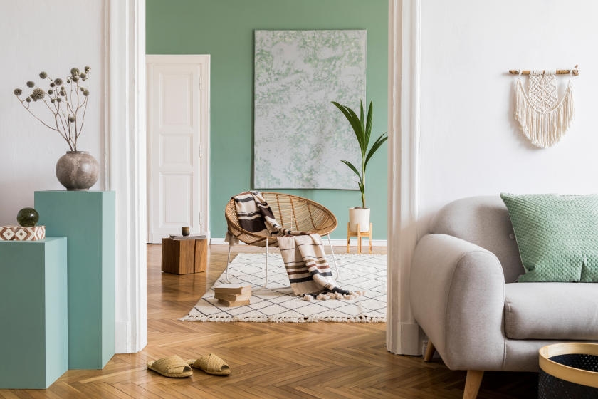
Consider Mood and Function
Different rooms serve different purposes, and color choice should reflect this. Soft, calming tones work well in bedrooms to promote relaxation, while energizing colors like yellows and greens can invigorate kitchens or home offices. By keeping the mood of each room in mind, you can select colors that complement the space’s function while still fitting within the overarching palette.
Use Accent Walls and Details
Incorporating accent walls or smaller details, such as trims, doors, or ceilings, allows you to introduce a bolder color without overwhelming the room. These accents can echo colors from nearby spaces, further strengthening the flow. For example, a deep emerald wall in a study could be mirrored with subtle decorative elements in the adjacent hallway, creating a sense of continuity and intentional design.
Invest in Quality Paint
The right paint can elevate the look of your home. High-quality paints offer richer pigments, better coverage, and longer-lasting finishes. Exploring premium brands, such as Little Greene paint St Albans, can provide both exceptional color depth and the reliability needed for a flawless finish. Their extensive range of shades ensures you can find the perfect tones to complement your home’s design and your chosen palette.
Test, Observe, and Adjust
Even after careful planning, the best results come from testing paint in your actual space. Paint sample boards or small wall sections allow you to observe how colors interact with light, furniture, and flooring. Don’t rush the decision; sometimes subtle adjustments to shade or finish can dramatically improve the overall flow.
Dilawar Mughal is an accomplished author with a passion for storytelling. His works span various genres, from thrilling mysteries to heartfelt romance novels. With a keen eye for detail and a knack for character development, Dilawar weaves engaging narratives that captivate readers and transport them to new worlds.